Do you want to create a mobile-ready responsive WordPress menu? Mobile users have already surpassed desktop users for a lot websites. Adding a mobile responsive menu makes it easier for users to navigate your website. In this article, we will show you how to easily create a mobile-ready responsive WordPress menu.
This is an in-depth tutorial. We will show both the plugin method for beginners (no coding) and the coding method for our more advanced users.
By the end of this tutorial, you will learn how to create a slide-in mobile menu, dropdown mobile menu, and a toggle mobile menu.
Ready? Let’s get started.
Video Tutorial
If you don’t like the video or need more instructions, then continue reading.
Method 1: Add a Responsive Menu in WordPress Using a Plugin
This method is easier and recommended for beginners as it requires no custom coding.
In this method, we will be creating a hamburger menu that slides out on mobile screen.
First thing you need to do is install and activate Responsive Menu plugin. For more details, see our step by step guide on how to install a WordPress plugin.
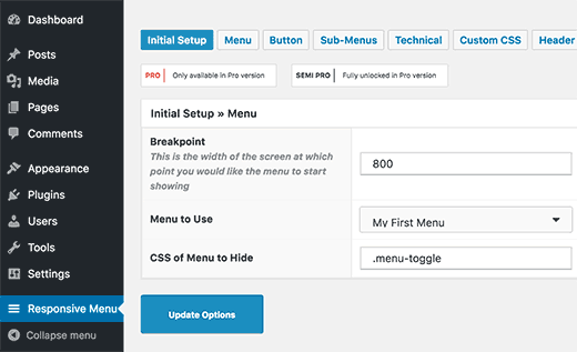
Upon activation, the plugin will add a new menu item labeled ‘Responsive Menu’ to your WordPress admin bar. Clicking on it will take you to plugin’s settings page.
First you need to enter the width of screen at which point the plugin will start showing responsive menu. The default value is 800px which should work for most websites.
After that, you need to select the menu you would like to use for your responsive menu. If you haven’t created a menu yet, then you can create one by visiting Appearance » Menus. See our guide on how to add navigation menu in WordPress for detailed instructions.
Last option on the screen is to provide a CSS class for your current non-responsive menu. This will allow the plugin to hide your non-responsive menu on smaller screens.
Don’t forget to click on the ‘Update Options’ button to store your settings.
You can now visit your website and resize your browser screen to see the responsive menu in action.
The responsive menu plugin comes with many other options which allow you to change behavior and appearance of your responsive menu. You can explore these options on plugin’s settings page and adjust them as needed.
Method 2: Add a Drop Down Select Menu Using a Plugin
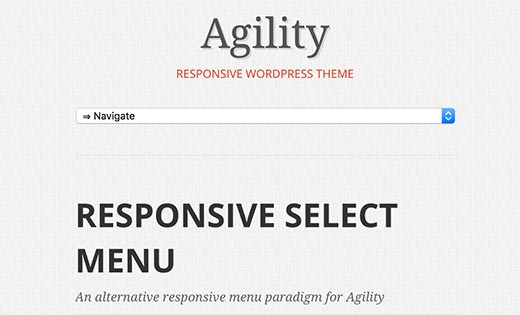
Another way to add a responsive menu is by adding a drop down select menu. This method does not require any coding skills, so it is recommended for beginners.
First thing you need to do is install and activate the Responsive Select Menu plugin. For more details, see our step by step guide on how to install a WordPress plugin.
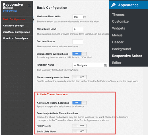
Upon activation, you need to visit Appearance » Responsive Select to configure plugin settings.
You need to scroll down to ‘Activate theme locations’ section. By default, the plugin is activated on all theme locations. You can change that by selectively turning it on for specific theme locations.
Don’t forget to click on the save all settings button to store your changes.
You can now visit your website and resize browser screen to see responsive select menu in action.
Method 3: Creating Mobile Friendly Responsive Menu with Toggle Effect
One of the most common used method to display a menu on mobile screens is by using the toggle effect.
This method requires you to add custom code to your WordPress files. If you haven’t done this before, then take a look at our guide on pasting snippets from web in WordPress.
First you need to open a text editor like notepad and paste this code.
( function() {
	var nav = document.getElementById( 'site-navigation' ), button, menu;
	if ( ! nav ) {
		return;
	}

	button = nav.getElementsByTagName( 'button' )[0];
	menu   = nav.getElementsByTagName( 'ul' )[0];
	if ( ! button ) {
		return;
	}

	// Hide button if menu is missing or empty.
	if ( ! menu || ! menu.childNodes.length ) {
		button.style.display = 'none';
		return;
	}

	button.onclick = function() {
		if ( -1 === menu.className.indexOf( 'nav-menu' ) ) {
			menu.className = 'nav-menu';
		}

		if ( -1 !== button.className.indexOf( 'toggled-on' ) ) {
			button.className = button.className.replace( ' toggled-on', '' );
			menu.className = menu.className.replace( ' toggled-on', '' );
		} else {
			button.className += ' toggled-on';
			menu.className += ' toggled-on';
		}
	};
} )(jQuery);
Now you need to save this file as navigation.js on your desktop.
Next, you need to open a FTP client to upload this file to /wp-content/themes/your-theme-dir/js/ folder on your WordPress site.
Replace your-theme-directory with your current theme’s directory. If your theme directory does not have a js folder, then you need to create it.
After uploading the JavaScript file, the next step is to make sure your WordPress site loads this JavaScript. You will need to add the following code to your theme’s functions.php file.
wp_enqueue_script( 'wpb_togglemenu', get_template_directory_uri() . '/js/navigation.js', array('jquery'), '20160909', true );
Now we need to add the navigation menu into our WordPress theme. Usually navigation menu is added into a theme’s header.php file.
<nav id="site-navigation" class="main-navigation" role="navigation">
			<button class="menu-toggle">Menu</button>
			<?php wp_nav_menu( array( 'theme_location' => 'primary', 'menu_class' => 'nav-menu' ) ); ?>
</nav>
We are assuming that the theme location defined by your theme is called primary. If it is not, then use the theme location defined by your WordPress theme.
The final step is to add CSS so that our menu uses the right CSS classes for toggle to work when viewed on mobile devices.
/* Navigation Menu */
.main-navigation {
	margin-top: 24px;
	margin-top: 1.714285714rem;
	text-align: center;
}
.main-navigation li {
	margin-top: 24px;
	margin-top: 1.714285714rem;
	font-size: 12px;
	font-size: 0.857142857rem;
	line-height: 1.42857143;
}
.main-navigation a {
	color: #5e5e5e;
}
.main-navigation a:hover,
.main-navigation a:focus {
	color: #21759b;
}
.main-navigation ul.nav-menu,
.main-navigation div.nav-menu > ul {
	display: none;
}

.main-navigation ul.nav-menu.toggled-on,
.menu-toggle {
	display: inline-block;
}

// CSS to use on mobile devices

@media screen and (min-width: 600px) {

.main-navigation ul.nav-menu,
	.main-navigation div.nav-menu > ul {
		border-bottom: 1px solid #ededed;
		border-top: 1px solid #ededed;
		display: inline-block !important;
		text-align: left;
		width: 100%;
	}
	.main-navigation ul {
		margin: 0;
		text-indent: 0;
	}
	.main-navigation li a,
	.main-navigation li {
		display: inline-block;
		text-decoration: none;
	}
	.main-navigation li a {
		border-bottom: 0;
		color: #6a6a6a;
		line-height: 3.692307692;
		text-transform: uppercase;
		white-space: nowrap;
	}
	.main-navigation li a:hover,
	.main-navigation li a:focus {
		color: #000;
	}
	.main-navigation li {
		margin: 0 40px 0 0;
		margin: 0 2.857142857rem 0 0;
		position: relative;
	}
	.main-navigation li ul {
		margin: 0;
		padding: 0;
		position: absolute;
		top: 100%;
		z-index: 1;
		height: 1px;
		width: 1px;
		overflow: hidden;
		clip: rect(1px, 1px, 1px, 1px);
	}
	.main-navigation li ul ul {
		top: 0;
		left: 100%;
	}
	.main-navigation ul li:hover > ul,
	.main-navigation ul li:focus > ul,
	.main-navigation .focus > ul {
		border-left: 0;
		clip: inherit;
		overflow: inherit;
		height: inherit;
		width: inherit;
	}
	.main-navigation li ul li a {
		background: #efefef;
		border-bottom: 1px solid #ededed;
		display: block;
		font-size: 11px;
		font-size: 0.785714286rem;
		line-height: 2.181818182;
		padding: 8px 10px;
		padding: 0.571428571rem 0.714285714rem;
		width: 180px;
		width: 12.85714286rem;
		white-space: normal;
	}
	.main-navigation li ul li a:hover,
	.main-navigation li ul li a:focus {
		background: #e3e3e3;
		color: #444;
	}
	.main-navigation .current-menu-item > a,
	.main-navigation .current-menu-ancestor > a,
	.main-navigation .current_page_item > a,
	.main-navigation .current_page_ancestor > a {
		color: #636363;
		font-weight: bold;
	}
	.menu-toggle {
		display: none;
	}

	}
You can now visit your website and resize your browser screen to see your responsive toggle menu in action.
Troubleshooting: Depending on your WordPress theme you may need to adjust the CSS. Use inspect element tool to figure out the CSS conflicts with your theme.
Method 4: Add a Slide-In Mobile Menu in WordPress
Another common technique to add a mobile menu is by using a slide-in panel menu (as shown in Method 1).
Method 4 requires you to add code to your WordPress theme files, and it is just a different way of accomplishing the same results as Method 1.
First, you need to open a plain text editor like Notepad and add the following code to a blank text file.
(function($) {
$('#toggle').toggle(
    function() {
        $('#popout').animate({ left: 0 }, 'slow', function() {
            $('#toggle').html('<img src="http://www.example.com/wp-content/themes/your-theme/images/menu.png" alt="close" />');
        });
    },
    function() {
        $('#popout').animate({ left: -250 }, 'slow', function() {
            $('#toggle').html('<img src="http://www.example.com/wp-content/themes/your-theme/images/menu.png" alt="close" />');
        });
    }
);
})(jQuery);
Don’t forget to replace example.com with your own domain name and your-theme with your actual theme directory. Save this file as slidepanel.js to your desktop.
Now you will need an image which will be used as a menu icon. A hamburger icon is most commonly used as the menu icon. You will find tons of such images from different websites. We will be using the menu icon from Google Material Icons library.
Once you find an image that you want to use, save it as menu.png.
Next, you need to open a FTP client client and upload slidepanel.js file to /wp-content/your-theme/js/ folder.
If your theme directory does not have the JS folder, then you need to create tit and then upload your file.
After that, you need to upload menu.png file to /wp-content/themes/your-theme/images/ folder.
Once the files are uploaded, we need to make sure that your theme loads the JavaScript file you just added. We will achieve this by enqueuing the JavaScript file.
Add this code to your theme’s functions.php file.
wp_enqueue_script( 'wpb_slidepanel', get_template_directory_uri() . '/js/slidepanel.js', array('jquery'), '20160909', true );
Now we need to add the actual code in your theme’s header.php file to display the navigation menu. You should look for code similar to this:
<?php wp_nav_menu( array( 'theme_location' => 'primary', 'menu_class' => 'nav-menu' ) ); ?>
You want to wrap existing navigation menu with the HTML code to display your slide panel menu on smaller screens.
<div id="toggle">
<img src="http://www.example.com/wp-content/themes/your-theme/images/menu.png" alt="Show" /></div>
<div id="popout">
<?php wp_nav_menu( array( 'theme_location' => 'primary', 'menu_class' => 'nav-menu' ) ); ?>
</div>
Notice that your theme’s navigation menu is still there. We have just wrapped it around HTML that we need to trigger slidepanel menu.
Last step is to add CSS to hide the menu image icon on larger screens. You will also need to adjust the position of the menu icon.
Here is a sample CSS that you can use as an starting point:
@media screen and (min-width: 769px) {
#toggle {
display:none;
}

}

@media screen and (max-width: 768px) {
#popout {
position: fixed;
height: 100%;
width: 250px;
background: rgb(25, 25, 25);
background: rgba(25, 25, 25, .9);
color: white;
top: 0px;
left: -250px;
overflow:auto;
}


#toggle {
float: right;
position: fixed;
top: 60px;
right: 45px;
width: 28px;
height: 24px;

}

.nav-menu li {
border-bottom:1px solid #eee;
padding:20px;
width:100%;
}

.nav-menu li:hover {
background:#CCC;
}

.nav-menu li a {
color:#FFF;
text-decoration:none;
width:100%;
}
}
Depending on your WordPress theme, you may need to adjust the CSS to avoid conflicts.
Here is how it looked on our demo website:
We hope this article helped you learn how to create a mobile-ready responsive WordPress menu. You may also want to see our guide on how to add a fullscreen responsive menu in WordPress
If you liked this article, then please subscribe to our YouTube Channel for WordPress video tutorials. You can also find us on Twitter and Facebook.
The post How to Create a Mobile-Ready Responsive WordPress Menu appeared first on WPBeginner.


Aucun commentaire:
Enregistrer un commentaire