Affichage des articles dont le libellé est Pages. Afficher tous les articles

samedi 12 novembre 2016

How to Add WordPress Navigation Menu in Posts / Pages


Do you want to display WordPress navigation menu in your posts or pages? Usually, your WordPress theme handles how and where navigation menus are displayed. In this article, we will show you how to add wordPress navigation menu in posts/pages or anywhere on your WordPress site.


Adding WordPress navigation menu in posts or pages


Why Add WordPress Navigation Menu in Posts/Pages


Navigation menus in WordPress provide an easy way to add a structured menu to your site.


You can create as many navigation menus as you want in your WordPress admin area, but you can only display them on menu locations available in your WordPress theme.


What if you needed to add a menu in a post or page? In that case, you will have to manually create a list of links which is not as efficient to manage as a WordPress menu.


Having said that, let’s see how you can add navigation menus in WordPress posts or pages.


Video Tutorial


If you don’t like the video or need more instructions, then continue reading.


Adding Navigation Menu in WordPress Posts/Pages


First thing you need to do is install and activate the Shortcode Menu plugin. For more details, see our step by step guide on how to install a WordPress plugin.


Before you can use the plugin, first you will need to create the navigation menu that you want to display. Go to Appearance » Menus to create it. See our beginner’s guide on how to add navigation menu in WordPress for detailed instructions.


Once your menu is ready, you can click on the Shortcode Menu from your WordPress admin bar. This will take you to the plugin’s shortcode generator page.


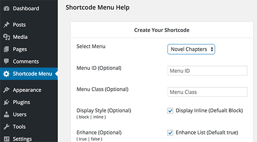
Shortcode Menu settings page


First you need to select the menu you want to add from the ‘Select Menu’ drop down list. If you need to add an ID or class attribute to your menu, then you can add those.


Next, you need to choose a display style for your menu. By default, your menu will be displayed as a block. You can change that to inline if you want to display the menu in a horizontal line.


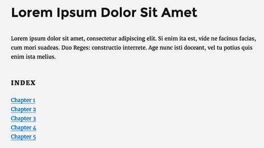
Default list type block menu


You can also change menu colors under ‘Design your menu on the fly’ section. The plugin allows you to select background, hover, and anchor colors.


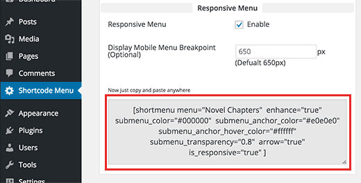
At the bottom of the shortcode generator column, you will find the shortcode with options you chose above. Simply copy the shortcode and paste it in the post, page, or widget where you want to display your menu.


Copy the menu shortcode to use in a post or page in WordPress


The plugin adds some basic style to make your menu presentable. But if you want to customize the appearance of the menu, then you will need to do that with CSS.


In the second column of the plugin’s settings page, you will find a basic CSS snippet. You can use that as an starting point by adding it to your child theme‘s stylesheet or by using Simple Custom CSS plugin.


However, if you are not familiar with CSS, then you can try CSS Hero. It is a powerful plugin that allows you to style anything on your WordPress site using a simple user interface and without writing any code.


We hope this article helped you add navigation menu in your WordPress posts or page. You may also want to see our guide on how to create a table of contents in WordPress post or page.


If you liked this article, then please subscribe to our YouTube Channel for WordPress video tutorials. You can also find us on Twitter and Facebook.


The post How to Add WordPress Navigation Menu in Posts / Pages appeared first on WPBeginner.


Rocking the New Facebook Timeline for Pages


alt="Rocking the New Facebook Timeline for Pages" src="http://whsr.webrevenueinc1.netdna-cdn.com/wp-content/uploads/2012/03/1020-6-500x197_c.jpg" />

March 30th is fast approaching, which is now known in the online marketing world as the day Facebook is unleashing the mandatory Timeline for Pages feature.  For Page administrators, it’s important to understand what this means and to develop a strategy for how to approach the updates.

If you haven’t explored Timeline in detail yet, or need a quick and dirty introduction to the absolute essentials, look no further.  This guide will get you started and make sure you are ready to handle the conversion to Timeline without stress.

What is Timeline, exactly?

Timeline is an initiative of Facebook founder Mark Zuckerberg to enable users to tell their stories more effectively on Facebook – their entire life story from birth through the present day, if they want.

In technical terms, your Timeline is essentially a place where you can “share and highlight your most memorable posts, photos, milestones,” along a framework that starts today and moves back through time to the year you were born.

The Timeline format was originally made available for personal Pages; with the March 30th update the format will be rolled out to businesses as the mandatory template for all Facebook Pages.Page.  Pages are the public profiles on Facebook that represent brands – from celebrities to businesses to causes and non-profits.  So if you are marketing a company, a brand, or a product on Facebook, this change will affect you.

Timeline will impact the user experience in two key ways.  Timelines are chronological and highly visual representations of the life of your business, so users will have a much more time-based and visual experience of your brand.  Second, it’s important to note that this forced feature switch will create a much more uniform experience for Facebook users when they interact with different brands.

The features (and guidelines) in Timeline, as you’ll see below, seem to encourage an approach from brands which is based on sharp visual choices and carefully curated content.

The images you choose, what you say in your About copy, and what content you call attention to are now more important than having a complex strategy of customized landing Pages.

With Timeline, marketers are being given a much more structured toolset to manage their activities on Facebook, and in turn have to update and customize their strategies to fit the new template.

Anatomy of a Timeline

There are several key features of a Timeline you’ll want to familiarize yourself with.  Here they are, with some quick hit details you’ll need to know.  We’ll then take a deeper dive, including some examples, further in this post.  The following screen shots of the Mashable Facebook Page are a great example of a well-done Timeline.

Cover photo The largest visual element on a Page, your cover photo (coming in at 851 x 315 pixels) is the big image at the top of your profile that communicates who you are and what your brand is all about.

class="border" alt="Demo On Facebook Timeline Page" src="http://www.webhostingsecretrevealed.com/images/2012/0327-1.jpg" width="750" />

Icon The icon is a small, 125 x 125 pixel image that appears in the lower left hand corner of your cover image.  In addition to giving you the chance to highlight something specific, it also acts as the thumbnail for all your conversations, comments, etc. each time you post to your wall.

class="border" alt="Demo On Facebook Timeline Page" src="http://www.webhostingsecretrevealed.com/images/2012/0327-2.jpg" width="750" />

Apps  Each profile can display multiple Apps, which always include your photographs in the #1 spot, and then include things like custom apps you create, individual components such as the total likes your Page has received, and third party apps you choose to integrate.

class="border" alt="Demo On Facebook Timeline Page" src="http://www.webhostingsecretrevealed.com/images/2012/0327-3.jpg" width="750" />

About  In the About section, you describe who you are, what your business does,  and include links to your website and calls to action.

class="border" alt="Demo On Facebook Timeline Page" src="http://www.webhostingsecretrevealed.com/images/2012/0327-4.jpg" width="750" />

Wall The Timeline wall is similar to the wall on a standard account, with the exception that it now takes up two columns.

class="border" alt="Demo On Facebook Timeline Page" src="http://www.webhostingsecretrevealed.com/images/2012/0327-5.jpg" width="750" />

New features such as pin content and highlight content allow you to put the focus on selected posts, photos, and discussions.

Goodbye Custom Landing Pages – And the Work Around

One of the biggest complaints and areas that are causing marketers anxiety is that the Timeline has gotten rid of custom landing Pages.  Sort of.

For marketers and business owners that spent a lot of money in developing custom landing Pages and Like Gates for Facebook, you’re going to need to do a reboot.

On the downside, anyone that comes to your brand Page via Facebook search will land on your default Timeline Page – your wall essentially.  This makes it harder to customize the experience of organic traffic, and to separate out what content you’re pushing to existing fans versus people who are just learning about you.

But you can still design custom landing Pages – these are now just called Apps.  The good news is that each app has a distinct URL. When  you are driving traffic to Facebook via email marketing, links on your website and more, you’ll be able to point people to your custom designed app by using the specific URL.

To find the URL, simply open the app and copy the URL from the navigation bar.  You’re good to go.  For example, check out the “submit news” app on the Mashable Page.

class="border" alt="Submitting News On Facebook Timeline Page - Example" src="http://www.webhostingsecretrevealed.com/images/2012/0327-6.jpg" width="750" />

The Cover Photo

Arguably the most important (at least, the most visual) part of your Timeline is your cover photo.  The cover photo appears at the top of your profile and is huge relative to the rest of your Page. It’s the first thing your visitors will see. It’s critical to choose a cover photo that conveys the essence of your brand, giving people a good idea of who you are, what you do, and the value you create.

But before you start grabbing the standard images in your digital marketing toolkit, read on. Facebook is cracking down on what can be included in cover photos, and has provided a long list of what can’t be in your cover image:

  1. Price or purchasing information: This means you can’t list product information, discounts, promotions, etc. in your cover photo.
  2. Contact information: Seriously. No websites, no emails, no phone numbers.
  3. References to other features: No encouraging people to “like” or “share” or “comment” on your stuff.
  4. Calls to action:  You can’t include things like “Visit us now” or “Get your free download.”

Finally, make sure that you own the rights to any cover photo.  No copyright violations allowed.

Each cover photo stands in at 851 x 315 pixels.

Ideas for your cover photo include pictures of your business, before and after photos if that matches your services, your company logo, or a picture of the face of your brand (if it’s a founder or spokesperson, for example).

Here are some examples of good quality cover photos that follow the rules, are eye catching, and represent their brands:

Smart Passive Income with Pat Flynn

class="border" alt="Good Cover Photos On Facebook Timeline Page" src="http://www.webhostingsecretrevealed.com/images/2012/0327-7.jpg" width="750" />

The New York Times

class="border" alt="Demo On Facebook Timeline Page" src="http://www.webhostingsecretrevealed.com/images/2012/0327-8.jpg" width="750" />

Kate Spade

class="border" alt="Demo On Facebook Timeline Page" src="http://www.webhostingsecretrevealed.com/images/2012/0327-9.jpg" width="750" />

Your Icon

Your icon is the thumbnail that appears in the lower left hand corner of your cover photo.  It gives you the chance to highlight different than what’s featured in your cover photo..
Some options include your headshot, your logo, or an iconic image of your product.

An interesting note about icons: when you upload the photo, the file needs to be 180 x 180 pixels.  When it displays in Facebook, it will be 125 x 125 pixels.

Your icon will also be the thumbnail image that’s displayed when you post on your Page, respond to comments, or interact anywhere else in the Facebook universe as your Page.

Here are a couple of good examples of icons that are visually interesting and work well with the Page’s cover photo: href="http://www.facebook.com/nytimes" target="_blank">New York Times and href="http://www.facebook.com/lewishowes" target="_blank">Lewis Howes’ Fan Page.

About Section

Since your cover photo can no longer feature things like your website URL or calls to action, your About section has become that much more critical.
Here, you want to introduce people to who you are, what your business does, and any calls to action like visiting your site or downloading a free report.

255 characters of the About section will appear under your icon.

If your Page is tied to a location, the address and phone number will appear there.  Most likely you’ll be connected to a location if you are a brick and mortar business, like a restaurant, salon, or shop. If your Page is unconnected to a location in Facebook, whatever you put in your about section – up to 255 characters, will display.

A couple of things to keep in mind:

  1. Be sure to include your URL, if you have one.  Facebook allows you to include a live link now, if you want.  The downside is that it will cost you the extra characters for http://.
  2. Include a call to action.  But don’t just say “Do this.”  Give people a reason why they should like your Page or download your report.
  3. Don’t forget the importance of keywords.  The usual SEO common sense applies – no keyword stuffing.  But make sure that you are going to show up in the search results and make sure to include your business name, your name if applicable, and your target industry.  E.G.  Jane Smith is author of the bestselling book, My Awesome Book.  Her work in the publishing and romance industries has made her both a fan favorite and industry expert.  Sign up for her latest contests and stories today.

Custom Apps

The Custom Apps section of the Facebook Timeline is one of the most important sections.  This is where you are able to create custom landing Pages for specific functions – this could be anything from the Submit News tab on Mashable (shown above) to the Bear Deodorant Protector movie from Old Spice (href="http://www.facebook.com/OldSpice/app_304165926269306" target="_blank">http://www.facebook.com/OldSpice/app_304165926269306).

Each profile can feature multiple custom apps that display on the right hand side under the cover photo.  The first one will always been your photographs (hint: the photo that will show will always be the most recent one you uploaded).

Other than that, you can select which apps to include from Page components (tip: display the “Likes” your Page has received – this is great social proof and a way to show growth over time) as well as the custom apps you create.  You can also include third party apps.

If you want to create your own custom apps and don’t have a lot of programming experience, there are some services to check out that can help you make a custom app via a WYSIWYG interface.  href="http://www.lujure.com/" target="_blank">Lujure.com is one source that people are discussing extensively; providers like Pagemodo and North Social are worth keeping an eye on as well.

When developing your app strategy, remember to keep a couple of things in mind::

  1. The apps you choose to display on your Page appear in valuable real estate at the top of your profile.  Choose ones carefully that you want people to visit.
  2. Custom apps can be used as custom landing Pages for visitors as long as you direct traffic to a specific URL (such as when you link from your website).

Managing Your Wall

A few things with the Timeline are different on your wall.  The wall still functions essentially the same – you can post content, such as comments, photos, or videos.  People can respond.  There are threaded conversations.

However, there are some differences.  One big difference is the size: the wall is now two columns wide.

There are also new features that allow you to emphasize specific content.  These are:

id="right">class="alignright" alt="Pin On Facebook Timeline Page" src="http://www.webhostingsecretrevealed.com/images/2012/0327-11.jpg" width="300" height="188" />

Pin

The Pin feature allows you to place a post at the top of your wall for up to seven days.  Only one piece of content can be pinned at a time, and a pin only lasts for seven days (or, until you replace it with a new pin).

To pin content, simply choose which post you want to select.  Click on the edit button (pencil symbol) in the upper right hand corner of the post.  Then choose “Pin to Top.”

Highlight

Highlight is a cool feature that allows you to really emphasize a post by selecting it so that it stands out on your Timeline.

A highlighted post will span both columns of your wall.  To highlight a post, simply select the post that you want and click the star in the upper right hand corner.

Note: a highlighted post will still appear chronologically in its place in your Timeline.

id="right">class="alignright" alt="Milestone On Facebook Timeline Page" src="http://www.webhostingsecretrevealed.com/images/2012/0327-10.jpg" width="300" height="150" />

Milestone

The Timeline also allows you to add big milestones to your Timeline.  This could be the year your business was founded, when you added a new product line, when you moved to a new location or the dates of big events or seminars you hosted (for just a few ideas).

To add a milestone, simply select the “milestone” button immediately above the area where you normally type a status update.

A box will appear, allowing you to select the date, name the milestone, add a description, and tie in photos or locations.

Milestones are a great way to add texture and nuance to your brand story and get the most out of the unique Timeline format.

Mastering the Admin Panel

The final section that’s worth noting of the new Timeline set up is the Admin Panel.

The Admin Panel allows you to make changes to your Timeline, monitor activity, and get real time feedback about how certain content is affecting your community.

The notifications section of the admin panel will show you all the activity on your Page – from new likes to comments to content that you’ve posted – in one central location.  This is a great tool for helping you keep track of interactions and engagement with your community.

Private messages are one of the best features of the new Timeline.   As long as private messages are enabled (Admin Panel > Manage > Settings – Ensure that the box next to Show “Message” button on [Page Name] is checked), visitors to your Page will be able to send you a private message through Facebook.  This new feature provides another channel for you to interact with customers, fans, and colleagues.

Finally, the Facebook Insights feature, which you access through your admin panel, allows you to see how often you are posting, which pieces of content are driving engagement, and the general sense of analytics of your site.  We could spend a whole post exploring how to use the admin panel in detail; I would encourage you to get to know this section of your Timeline, as it can give critical guidance on your content and engagement strategies.

So there you have it.  I hope that the Facebook Timeline is a little less scary now, and that you’re feeling prepped to dive in.

The key message is this: Be proactive; and make sure you’re set up with at least the essential ingredients of a Page (cover photo, icon, about description) before March 30th.

Then experiment with the new features to find out what resonates the most with your core audience.  Remember, while the format is different than the traditional Page set up, the Timeline upgrade can be a great excuse to hit pause and make sure that you’re doing everything you can to effectively tell your story and engage your audience on Facebook.

Now go href="http://www.webhostingsecretrevealed.net/blog/socialmedia-marketing/tips-and-tools-to-spice-up-your-facebook-timeline/">spice up your Facebook Timeline!


Page 25 – Web Hosting Secret Revealed


How To Create A Custom Administration Pages in WordPress Dashboard


alt="How To Create A Custom Administration Pages in WordPress Dashboard" src="http://whsr.webrevenueinc1.netdna-cdn.com/wp-content/uploads/2013/06/1-500x200_c.jpg" />

When WordPress unveiled what used to be its standard theme, Kubrick, several years ago, it also took the wraps of an exciting new feature. That feature was the custom theme administration panel, enabled by defining functions and preferences in the theme-specific “functions.php” file. In the years that have ensued, the theme options page has been sadly underused by many theme designers, but it’s actually a great way to give users control over their site’s appearance without forcing them to install a new theme. THings like the theme background image, number of columns, and even font colors can all be changed using this custom administration panel.

The administration panel itself is changed by filling the theme’s functions file with a series of PHP arrays that define custom values. Those values are then included in the template and they are defined in an administration panel that allows users to define their appearance preferences visually. The whole process is actually relatively simple once the theme designer learns how a PHP works and how they can leverage that piece of code to allow custom presentation within their template files.

The several-step process all begins by setting a few site wide variables and defining what should be customized in this new administration page.

Step 1: Creating and Editing the Theme-Specific Functions.php Page

class="border" alt="" src="http://www.webhostingsecretrevealed.com/images/2010/1104-1.jpg" width="600px" />

If you’ve developed your own theme, chances are pretty slim that you’ve made a functions.php file to be paired with the existing template files. This is a relatively advanced options and most designers simply skip it altogether. In this case, it’s essential to open your FTP client of choice and point it to the following server URL where the theme’s files reside:

/public_html/wp-content/themes/YOUR-THEME-FOLDER/

Once inside this folder, double check to make sure there’s no “functions.php” file present and then use your text editing program to create a new file named “functions.php.” This file can then be saved and uploaded to the server via FTP. It can be edited directly on the server, eliminating the need for the text editing program.

The first step to having a valid theme options panel defined in the “functions.php” file is to define two variables at the top of the document. These variables will be used to display the theme’s name using the Dashboard, as well as identify form and selection elements within that administration page. Observe the code below, place it into the top of your “functions.php” document, and customize it to your site’s needs.

$longname = “Administration Panel Development Theme”;
$shortcode = “apdt”;

These variables serve different purposes. The $longname variable will be used to print the theme’s name in the actual administration options panel. For this reason, it is recommended that developers assign the theme’s exact name to this variable in order to eliminate confusion among their theme’s users. The $shortcode variable should be all lowercase letters without any punctuation, as this will be used to identify form elements within the code itself. In the example, a simple acronym was used based on the theme’s full name; this can be customized to a user’s tastes.

Step 2: Defining Customizable Preferences Using PHP Arrays

First, it’s important to tell the theme what the administration panel’s name is. This will be printed above all of the potential settings and helps foster clarity of purpose to novice users. This is done by adding the following array to the $settings tag within the “functions.php” file:

$settings = array (
array( “name” => $longname.” Appearance Settings”,
“type” => “title”),

Next, we must indicate that the array full of options is “open,” or able to be modified by user input. This is done using another simple array that appears right below the definition of the page’s title. It looks like this:

array( “type” => “open”),

Now we are free to begin defining theme appearance options, with each one of them being created as a new array. In this example, we’re going to define the text which is placed in the theme’s footer. By default, the example theme contains a link to the theme developer’s website as well as teem versioning information. This is not desirable by a large number of WordPress users who would prefer to place their own information in the footer, however, so enabling this custom control saves them the manual editing of the “footer.php” file. Here’s how it’s done.

array(
“name” => “Custom Theme Footer Text”,
“desc” => “This is the text displayed at the very end of every page contained within this theme.”,
“id” => $shortcode.”_custom_footer”,
“type” => “text”,
“std” => “Experimental Theme v1.0. Developed by John Doe. More themes here.”),

The array above allows the user to determine the theme’s standard footer text, but the array tags need to be explained to better describe just how this process works and what each part of the array defines.

Name: This refers to the name of the actual text box itself, and is not presented to users when they enter the administration options page for the theme.

Desc: This is a short description that accompanies the custom setting, and this is displayed to users.

ID: This uses the short code along with a custom-made identification of the form name in order to both present and style the text box.

Type: This defines whether the form element is a text line, a text box, a drop down menu, a radio button, or a checkbox.

STD: This determines the default value of the selected element. For a text box, this determines the default text entered into it. For checkboxes, radio buttons, and drop down boxes, this determines which option is selected by default.

Step 3: Telling WordPress to Enable Access to the New Options Page

Even though the options page has been given a purpose using the “functions.php” file within a theme’s home folder, it has yet to be recognized by WordPress or included among the many other settings page within the WordPress Dashboard. This is because the theme’s option page must be identified in the functions page and told where to go (either as an independent sidebar element or within the “Settings” grouping). This is done using a relatively simple function which is added to the “functions.php” file below the arrays of potential customizations:

function experimental_theme_save_values() {
global $longname, $shortcode, $settings;
if ( $_GET[‘page’] == basename(__FILE__) ) {
if ( ‘save’ == $_REQUEST[‘action’] ) {
foreach ($settings as $value) {
update_option( $value[‘id’], $_REQUEST[ $value[‘id’] ] ); }
foreach ($settings as $value) {
if( isset( $_REQUEST[ $value[‘id’] ] ) ) { update_option( $value[‘id’], $_REQUEST[ $value[‘id’] ] ); } else { delete_option( $value[‘id’] ); } }
header(“Location: themes.php?page=functions.php&saved=true”);
die;
} else if( ‘reset’ == $_REQUEST[‘action’] ) {
foreach ($settings as $value) {
delete_option( $value[‘id’] ); }
header(“Location: themes.php?page=functions.php&reset=true”);
die;
}
}
add_menu_page($longname.” Appearance Settings”, “”.$longname.” Appearance Settings”, ‘edit_themes’, basename(__FILE__), ‘experimental_theme_save_values’);

This piece of code does two things. First, it allows the theme’s settings to be saved via the administration options panel. Secondly, it places an independent button in the WordPress Dashboard’s sidebar that allows a user to click it and go directly to theme options panel. It is labeled “Appearance Settings” just like the actual page itself. Consistency is the key to eliminating confusion and directing users to the page without specifically telling them to make their way to the options panel to customize the theme’s appearance.

Step 4: Adding Error Messages and Closing the PHP File

The final step to filling in all the elements of the theme options panel is to define error messages that a user may encounter and then make sure that the form elements can be presented in the default WordPress style within the options page. Adding the error messages is done by pasting this code into the PHP functions file:

function experimental_theme_save_values() {
global $longname, $shortcode, $settings;
if ( $_REQUEST[‘saved’] ) echo ‘
‘.$themename.’ appearance customizations have been saved successfully.
‘;
if ( $_REQUEST[‘reset’] ) echo ‘
‘.$themename.’ appearance customizations have been successfully reset.
‘;

Beneath these two lines of code, the PHP section of the functions.php file can be closed using the ?> ending tag. Below this, XHTML code will be placed to style the elements using the standard WordPress Dashboard stylesheet.

Step 5: Giving the Options Page Some Style

Currently, WordPress Dashboard users can see the new error page but they can’t do much with it. That’s because the form elements and the stylesheet have not yet been placed into the functions.php file for use within the administration interface. That’s all about to change, as we include the stylesheet and default form elements for use by the new panel:

< div class=”wrap” >
< h2>< ?php echo $longname; ? > Settings< /h2 >

< form method=”post” action=”options.php” >

< ?php break; case ‘text’: ? >

< tr>
< td width=”20%” rowspan=”2″ valign=”middle” >< strong >< ?php echo $value[‘name’]; ? >< /strong >< /td >
< td width=”80%” >< input style=”width:100%;” name=”< ?php echo $value[‘id’]; ? >” id=”< ?php echo $value[‘id’]; ? >” type=”< ?php echo $value[‘type’]; ? >” value=”< ?php if ( get_settings( $value[‘id’] ) != “”) { echo get_settings( $value[‘id’] ); } else { echo $value[‘std’]; } ? >” / >< /td >
< /tr >

< tr >
< td >< small >< ?php echo $value[‘desc’]; ? >< /small >< /td >
< /tr >< tr >< td colspan=”2″ > < /td >
< /tr >

< ?php break;} ? >

< input type=”submit” value=”< ?php _e(‘Save Theme Settings’) ? >” / >

This code is pasted below the closing tag of the PHP functions file, and can be customized for each type of form that a theme options panel might include. The “case” variable can be changed from “text” to things like text box, checkbox, select, and title. These forms only need to be included, defined, and styled, if they are being used by the theme. Otherwise, their inclusion is not necessary and leaving then out of the theme’s functions file will promote efficiency and clean code.

Step 9: Enabling the Custom Option to be Seen on the Actual Theme

There are two steps to execute when making sure that any changes can be seen on a theme’s public templates. The first is to place a variable into the theme’s footer which will display the user-defined copyright and versioning text that we enabled in the earlier steps of this tutorial. That is done by placing the following code in the footer copyright area:

< ?php echo $apdt_custom_footer; ? >

This text calls the custom array for the footer text that was defined earlier and, per the “Echo” statement, prints that text in the footer. This tag can be contained within any XHTML tags a user sees fit, but it will not show up without a piece of code added to the site’s header.

In the header, the theme must be instructed to look for the user-defined options that are set within in the WordPress Dashboard, and it must know the variables that are defined in the custom “functions.php” file so it can print their content onto the website. This is done by placing the following PHP variable in the header of the website (typically the “header.php” file):

< ?php global $settings;
foreach ($settings as $value) {
if (get_settings( $value[‘id’] ) === FALSE) { $$value[‘id’] = $value[‘std’]; } else { $$value[‘id’] = get_settings( $value[‘id’] ); }
}
? >

That’s all there is to it. Now, every option defined in the custom functions.php file can be reflected in the page’s appearance simply by including a custom-defined PHP variable where the designated customizations and content are supposed to take effect.

Step 10: Test the New Settings and the Options Page

No WordPress development effort is fully complete until it has been thoroughly tested for bugs, errors, and accidental errors in the PHP code placed into the “functions.php” file. That said, it’s time to get testing! Log in to the WordPress Dashboard and, if the theme you’ve been working on is not currently selected, make sure to navigate to the “Appearance” category in the sidebar and activate the relevant theme.

From there, check a few things:

  1. Make sure the theme’s settings link appears as its own entity in the sidebar underneath the “Settings” sidebar category heading.
  2. Ensure that the designated footer text customization option can be accessed in the custom options control panel; modify the default content of the footer and save the preference. Make sure that it saves without an error.
  3. Visit your actual, public website, and ensure that the changes made within the Dashboard concerning the content of the footer are displayed.
  4. If everything functions properly, breathe a sigh of relief and enjoy your first WordPress theme options control panel page.

Page 20 – Web Hosting Secret Revealed


A Collection Of 10 Incredible & Funny 404 Error Pages Design


alt="A Collection Of 10 Incredible & Funny 404 Error Pages Design" src="http://whsr.webrevenueinc1.netdna-cdn.com/wp-content/uploads/2014/02/Audiko-500x300_c.jpg" />

style="font-family: Roboto, sans-serif; font-size: 15px; line-height: 1.5em;">One of the most important aspects, which is often neglected by the website designers, is the proper handling of 404 error page. We can see that when visitors reach at this page, they have wiped out connection with the website due to some reasons. It may be possible due to HTTP server problem, wrong URL path, broken link or removal of any page from the website.

If you are running a fully functional website or blog site, then each & every page of the site, even invalid page is also considered. Error pages are a common phenomenon today, so keep in mind that a creatively designed error page always helps you stay hold visitors for a long time or recommend them to locate the right path again. Indeed, a creative as well as an attractive 404 page design offers a comfortable environment to the website visitors. Hence, you should spice up this page with some innovative components into a presentable format.

Being a skilled graphic designer, I always give the importance to the maintenance of every page of a site. Despite including an endured or uninformative 404 page, you should mainly focus on the building of an innovative page that thrills visitors, when they land upon it.

Key Reasons To Build A Custom 404 Error Page

To Enhance & Maintain Trust

A nice & extensive custom 404 page ID is very important to maintain the trust of viewers. The uninformative 404 error page can lead the visitors to wind up their search with a particular site. I have seen a number of websites, which don’t have custom error page and it loses the trust of viewers by confusing them.

To Keep Users Engaged

A creatively designed error page can urge visitors to go back on the previous page and locate the right stuff as per their need. It helps you build a readership and href="http://www.webhostingsecretrevealed.net/blog/inbound-marketing/tips-on-improving-your-site-bounce-rate/">stay engaged viewers with your site or blog.

To Have A Better Website Design

As per the current trend, site is counted in poorly designed without having custom 404 page. So, it’s a time to create an incredible and inspirational error page to covey the right message.

List of 10 Innovative 404 Error Pages for Your Inspiration

href="http://www.tumblr.com/">Tumblr

style="text-align: center;">class="aligncenter size-full wp-image-8678 border" src="http://whsr.webrevenueinc1.netdna-cdn.com/wp-content/uploads/2014/02/Tumblr.jpg" alt="Tumblr" width="750" height="450" srcset="http://whsr.webrevenueinc1.netdna-cdn.com/wp-content/uploads/2014/02/Tumblr.jpg 750w, http://whsr.webrevenueinc1.netdna-cdn.com/wp-content/uploads/2014/02/Tumblr-300x180.jpg 300w" sizes="(max-width: 750px) 100vw, 750px" />

Wow! A simple & moving image of colorful diamond appears at the Tumblr’s 404 page. The moving image is simple and blur, but it’s an innovative approach with a search bar. Log-in and sign up links are available at the right bottom of the page. I love the implementation of this creative idea.

href="http://www.csschopper.com/">CSSChopper

style="text-align: center;">class="aligncenter size-full wp-image-8674 border" src="http://whsr.webrevenueinc1.netdna-cdn.com/wp-content/uploads/2014/02/CSSChopper.jpg" alt="CSSChopper" width="750" height="450" srcset="http://whsr.webrevenueinc1.netdna-cdn.com/wp-content/uploads/2014/02/CSSChopper.jpg 750w, http://whsr.webrevenueinc1.netdna-cdn.com/wp-content/uploads/2014/02/CSSChopper-300x180.jpg 300w" sizes="(max-width: 750px) 100vw, 750px" />

Simplicity is a key of professional web design that manages all the information of page in a stunning manner in order to make a site user-friendly and increase website traffic. CSSChopper is one of the best examples of such types of sites, which is simple, yet professionally designed. The 404 page of this site includes an image and truly conveys a message that you are going to lose connection with us, so go back and locate the right page, otherwise click on the “home page” or “contact”.

href="http://metro.co.uk/">Metro

style="text-align: center;">class="aligncenter size-full wp-image-8676 border" src="http://whsr.webrevenueinc1.netdna-cdn.com/wp-content/uploads/2014/02/Metro.jpg" alt="Metro" width="750" height="456" srcset="http://whsr.webrevenueinc1.netdna-cdn.com/wp-content/uploads/2014/02/Metro.jpg 750w, http://whsr.webrevenueinc1.netdna-cdn.com/wp-content/uploads/2014/02/Metro-300x182.jpg 300w" sizes="(max-width: 750px) 100vw, 750px" />

Metro 404 page is really cool because of a cute bear images, who is scatting. This image has only “WoW” effect and desperate visitors to click & redirect at the home page of this site. The proper links are given at this site, but a space is very small according to the page. A large space of this page is blank, which makes it a poor design.

href="http://sea.blizzard.com/">Blizzard Entertainment

style="text-align: center;">class="aligncenter size-full wp-image-8671 border" src="http://whsr.webrevenueinc1.netdna-cdn.com/wp-content/uploads/2014/02/Blizzard-Entertainment.jpg" alt="Blizzard-Entertainment" width="750" height="455" srcset="http://whsr.webrevenueinc1.netdna-cdn.com/wp-content/uploads/2014/02/Blizzard-Entertainment.jpg 750w, http://whsr.webrevenueinc1.netdna-cdn.com/wp-content/uploads/2014/02/Blizzard-Entertainment-300x182.jpg 300w" sizes="(max-width: 750px) 100vw, 750px" />

An incredible 404 error page design can be seen at Blizzard, which is very visually appealing. Amazingly use of “broken mirror” & the broken links showcase that site has cracked and falling apart. So, decide to go back with the help of few available links and complete your search efficiently without any sort of hassle. A list of links is properly managed. The use of background is seriously appreciable and perfectly fitted with every possible links.

href="http://casualbrandshop.com/">Casual Brand Shop

style="text-align: center;">class="aligncenter size-full wp-image-8672 border" src="http://whsr.webrevenueinc1.netdna-cdn.com/wp-content/uploads/2014/02/Casual-Brand-Shop.jpg" alt="Casual-Brand-Shop" width="750" height="456" srcset="http://whsr.webrevenueinc1.netdna-cdn.com/wp-content/uploads/2014/02/Casual-Brand-Shop.jpg 750w, http://whsr.webrevenueinc1.netdna-cdn.com/wp-content/uploads/2014/02/Casual-Brand-Shop-300x182.jpg 300w" sizes="(max-width: 750px) 100vw, 750px" />

This 404 error page design is definitely eye-catching, which is the most important thing to engage more customers & convert them into the sales figure. By including valuable resources & links, this page enhances the comfort of customers & redirects to the appropriate location. Fully funny, yet target-oriented and visually appealing approach.

href="http://www.collegehumor.com/">College Humor

style="text-align: center;">class="aligncenter size-full wp-image-8673 border" src="http://whsr.webrevenueinc1.netdna-cdn.com/wp-content/uploads/2014/02/College-Humor.jpg" alt="College-Humor" width="750" height="455" srcset="http://whsr.webrevenueinc1.netdna-cdn.com/wp-content/uploads/2014/02/College-Humor.jpg 750w, http://whsr.webrevenueinc1.netdna-cdn.com/wp-content/uploads/2014/02/College-Humor-300x182.jpg 300w" sizes="(max-width: 750px) 100vw, 750px" />

Once you reach at this 404 page of “College Humor”, you will see some animated pictures of people & animals, who are fighting with each other. Nothing so much creative, but the interesting thing with this page is that it automatically redirects to the home page after few seconds without clicking any link. I like only this approach, rather than design.

href="http://agens.no/">Agens

style="text-align: center;">class="aligncenter size-full wp-image-8669 border" src="http://whsr.webrevenueinc1.netdna-cdn.com/wp-content/uploads/2014/02/Agens.jpg" alt="Agens" width="750" height="456" srcset="http://whsr.webrevenueinc1.netdna-cdn.com/wp-content/uploads/2014/02/Agens.jpg 750w, http://whsr.webrevenueinc1.netdna-cdn.com/wp-content/uploads/2014/02/Agens-300x182.jpg 300w" sizes="(max-width: 750px) 100vw, 750px" />

One of the coolest error page designs with illustration. At the first part of the page, an image of animated person is beautifully adjusted. As you hover over this image and scroll cursor, the image also moves with the background. This site conveys a message that you have lost your path. So, you need to locate the appropriate path to complete your search. Simple, yet interesting idea is very cleverly used and surely influence visitors, either to click on the links or go back at the home page.

href="http://iamww.com/">I am Will Wilki

style="text-align: center;">class="aligncenter size-full wp-image-8675 border" src="http://whsr.webrevenueinc1.netdna-cdn.com/wp-content/uploads/2014/02/I-am-Will-Wilki.jpg" alt="I-am-Will-Wilki" width="750" height="455" srcset="http://whsr.webrevenueinc1.netdna-cdn.com/wp-content/uploads/2014/02/I-am-Will-Wilki.jpg 750w, http://whsr.webrevenueinc1.netdna-cdn.com/wp-content/uploads/2014/02/I-am-Will-Wilki-300x182.jpg 300w" sizes="(max-width: 750px) 100vw, 750px" />

This error page has a blur image that includes two people, who are indicating, there is an error & “road not found”. This image creatively explains everything, you are at wrong place and need to go back. The image is very simple, without having navigation & animation, but perfect for this page.

href="http://www.modcloth.com/">Mod Cloth

style="text-align: center;">class="aligncenter size-full wp-image-8677 border" src="http://whsr.webrevenueinc1.netdna-cdn.com/wp-content/uploads/2014/02/Mod-Cloth.jpg" alt="Mod-Cloth" width="750" height="456" srcset="http://whsr.webrevenueinc1.netdna-cdn.com/wp-content/uploads/2014/02/Mod-Cloth.jpg 750w, http://whsr.webrevenueinc1.netdna-cdn.com/wp-content/uploads/2014/02/Mod-Cloth-300x182.jpg 300w" sizes="(max-width: 750px) 100vw, 750px" />

“Mod Cloth” is a cloth selling site, which used a cute doggy image at 404 page to make this page highly-visual. The arrangement of links & menu bars is outstanding and cleverly used with illustration. All the relevant information can be found at this error page, without hassle. Apart from image, the rest of the part is the same as the home page, means the menus & the footer. Definitely, it is an attractive page to stay hold visitors and engage. I like the way of representation of the Mod Cloth’s 404 page.

href="http://audiko.net/">Audiko

style="text-align: center;">class="aligncenter size-full wp-image-8670 border" src="http://whsr.webrevenueinc1.netdna-cdn.com/wp-content/uploads/2014/02/Audiko.jpg" alt="Audiko" width="750" height="450" srcset="http://whsr.webrevenueinc1.netdna-cdn.com/wp-content/uploads/2014/02/Audiko.jpg 750w, http://whsr.webrevenueinc1.netdna-cdn.com/wp-content/uploads/2014/02/Audiko-300x180.jpg 300w" sizes="(max-width: 750px) 100vw, 750px" />

The illustration of Audiko’s 404 page covers the entire page with few links and a search bar. The main focus of Audiko is on creating illustration that includes animated people & other symbols. For the viewers’ comfort, the use of search bar is good to returning on the right page.


Page 15 – Web Hosting Secret Revealed